

Flags: The good, the bad, and the ugly
A flag is a very important representation of a country–displaying its history, heritage, and culture. It can signify a country’s ideals, history, or topography. Some flags are better than others, and there are even quite a few bad ones–really, really bad ones. So that brings up the question, what are some of the worst flags in the world?
But to answer that question, we first have to understand what makes a flag good. There are usually four different criteria that vexillographers mention. Vexillography is the art of designing and creating flags. The four criteria include Simplicity, Distinction, Colors, and Symbolism.
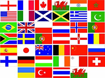
 Simplicity: Simplicity is pretty self-explanatory. Keep the design of the flag simple. A good example of a simple flag would be any tri-colored flag, such as that of Italy, France, and Russia just to name a few. And it doesn’t get much simpler than Japan’s flag, a large red dot on a white field. The United States of America’s flag, however, lacks simplcity. There are 13 lines, alternating in color from red to white, the blue square in the corner, and the fifty white stars.
 Symbolism: Symbolism is the use of images with meaningful and important representation in your flag. A great example of meaningful symbolism in a flag is the flag of Alaska. Alaska’s flag consists of 8 gold stars forming the Big Dipper, which symbolizes a bear, indigenous to Alaska. An example of overzealous symbolism in a flag is the proposed flag for the European Union from 2002. This flag was never actually used, but it exists, so it works as an example. This flag symbolized every European country, from the very west to the very east, by combining every single flag, resulting in a horrible eye sore of over 40 colors.
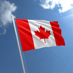
 Distinction: This means how distinctive a flag is from other flags, through color scheme, pattern, and more. An example of a distinct flag is the flag of Canada. There is no other flag that looks like it. In contrast, flags with seals are not distinct. From a distance, every seal looks the same. And even up close, many seals bear too many similarities to create distinction. The most internationally recognized flags, according to a poll, are the United States, the United Kingdom, Canada, and Japan.
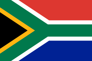 Color Scheme: A flag’s color palette is important to its overall appeal. The colors should compliment each other, which often means they are across from one another on the color wheel–like blue and yellow. In many cases, the colors of a flag also serve as symbolism. For example, the flag of South Africa. With a total of six colors, the flag might not offer simplicity or visual appeal, but it does offer meaning. According to World Atlas, the red, white and blue colors were taken from the colors of the Boer Republics. The yellow, black and green are taken from the African National Congress flag. “Black symbolizes the people, green the fertility of the land, and gold the mineral wealth beneath the soil.”
Now that the topic of what makes a flag favorable has been covered, what are the best and the worst flags the world has to offer?
As far as the best, one could say any that follow all four rules; it is really up to personal opinion. According to many vexillographers, though, the European tricolor flags earn high praise: Three colors, almost all look great together, very simple, no seals, and distinct enough to be told apart with relatively ease.
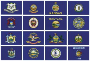
Now what about the bad ones? That is truly where the fun begins. There are not only country flags, but also state flags, county flags, province flags, city flags, and so on.
 So those bad flags, what are they, and how bad are they? Well, they are very bad. Take for example the recently-retired flag of Pocatello, Idaho. This flag gained international infamy and went viral–leading to it being changed in 2016. The flag gained the most slack for the copyright notice and trademark on it.
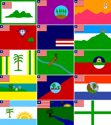 Liberia, too, has received criticism for its flag, mostly because it is so similar to the United States flag. But the Liberian County Flags are much worse. These flags resemble something made by elementary school students in Microsoft Paint when they were really bored in class. And the Liberian flag is stuck awkwardly in the top left corner. For every single one.
Now, imagine a blank flag template. Imagine you the designer, are asked to create a flag–whatever you please. Imagine you covered the whole canvas green, and called it a day. Enter, the retired flag of Libya. That green rectangle on your screen isn’t a picture failing to oad properly, it’s the the old flag of Libya–quite literally a blank green flag with nothing on it. No stripes, no shapes, no nothing. Just green. 
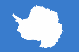
Another flag that misses the mark is the flag of Antarctica. Baby blue, with the borderlines of Antarctica, it looks a bit like an inkblot test.
In conclusion, there are many qualities that make a flag good, and there are a variety of flags across the globe–some elegantly simple, some internationally recognized, some unremarkable, and some in desperate need of a makeover.